Loading...

Category: collaboration

Enkidoo - Ferrero1947

Enkidoo

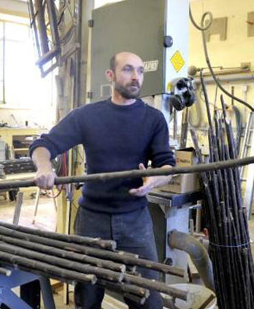
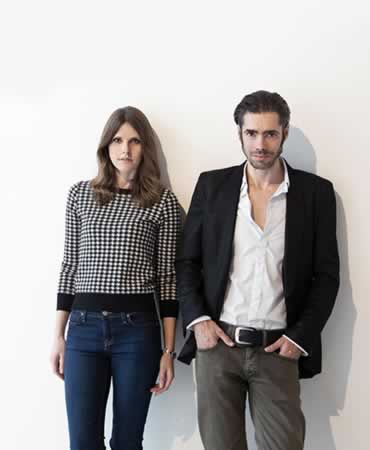
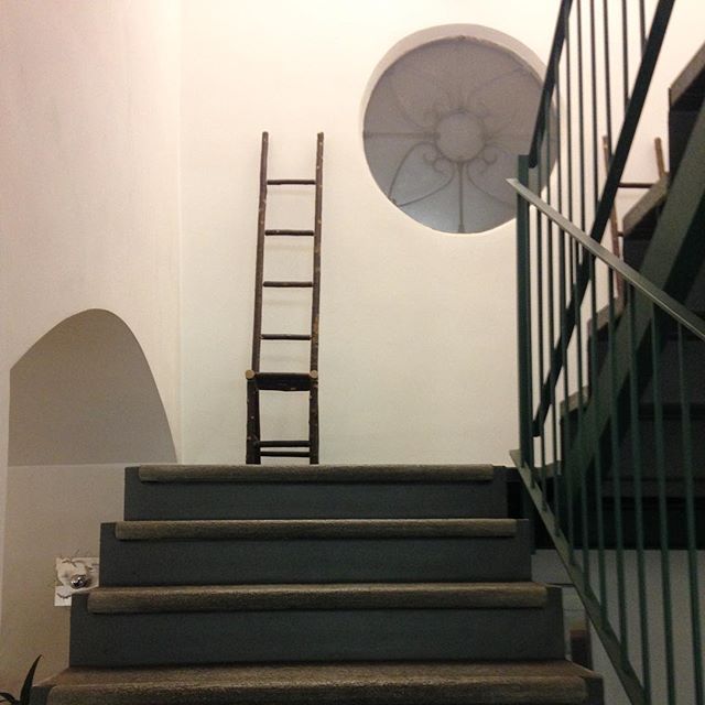
For about 20 years Cyril Delage, with the pseudonym of Enkidoo, has transformed wood into refined furniture or very poetic decorative accessories according to his wishes and those of others and uses self-criticism and irony with the same dexterity with which he models the chestnut armchairs on which he loves to work early in the morning, when the sun comes to disturb him in his laboratory surrounded by nature. The rays shine on the cobwebs that frame the tesserae of what was, several years ago, the Chalard school and who experienced a reawakening of energy thanks to this enlightened and lonely artist. Standing in the middle of what an uninformed person could confuse with a joyful unorganized bazaar, Cyril, 48, loves to tell his job in a sincere way.
Known in Europe and also in Japan, designer, decorator, carpenter, agitator of ideas, he is certainly atypical, declaring without delay a reasonable turnover, which depends on the years, the wood, the inspiration, the moment …
Enkidoo, passionate and tenacious self-taught, who has become known in international fairs and exhibitions in galleries in Paris, Belgium, England and Italy by Ferrero1947, who met him at the beginning of his activity, responds to the requests of loyal and passionate customers of his art, but first of all to his personal needs.
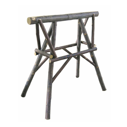
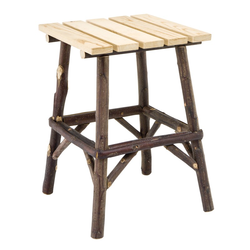
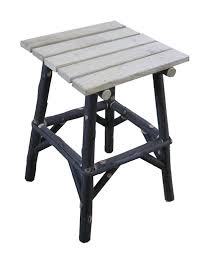
His choices on wood tend to favor the woods of his region, in particular chestnut, rather than Canadian species; sometimes, it adds metal to design furniture and decorative accessories.
Where do Enkidoo get his inspiration from ? He does not say it precisely, or perhaps he does not want to reveal it and is confident that he has roughly one idea per minute, but in an hour … admitting that when one creates, he actually has many constraints, never being completely free. Some specimens are born from personal needs such as small tables made almost by chance for grandchildren for Christmas; being two advanced, they were seen by some customers and the request was born.
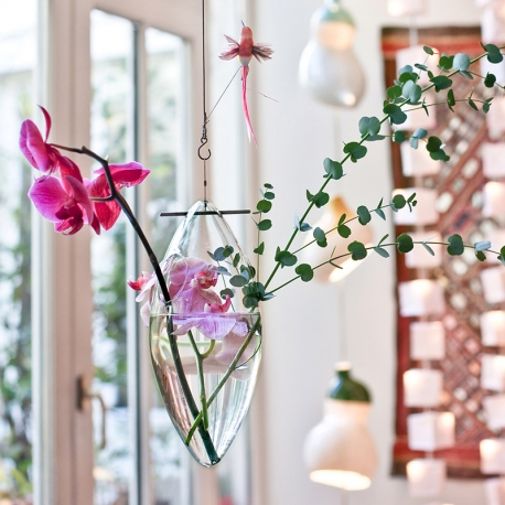
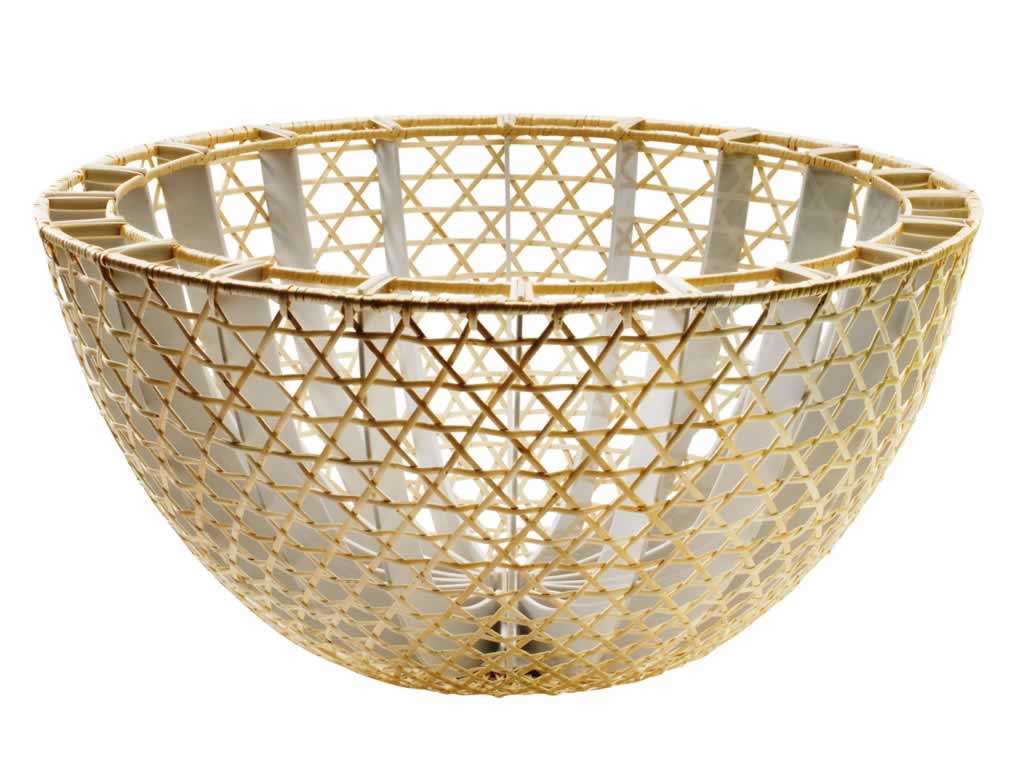
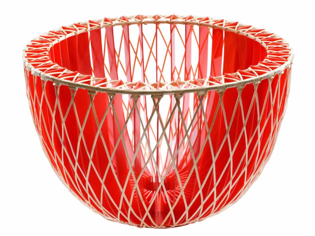
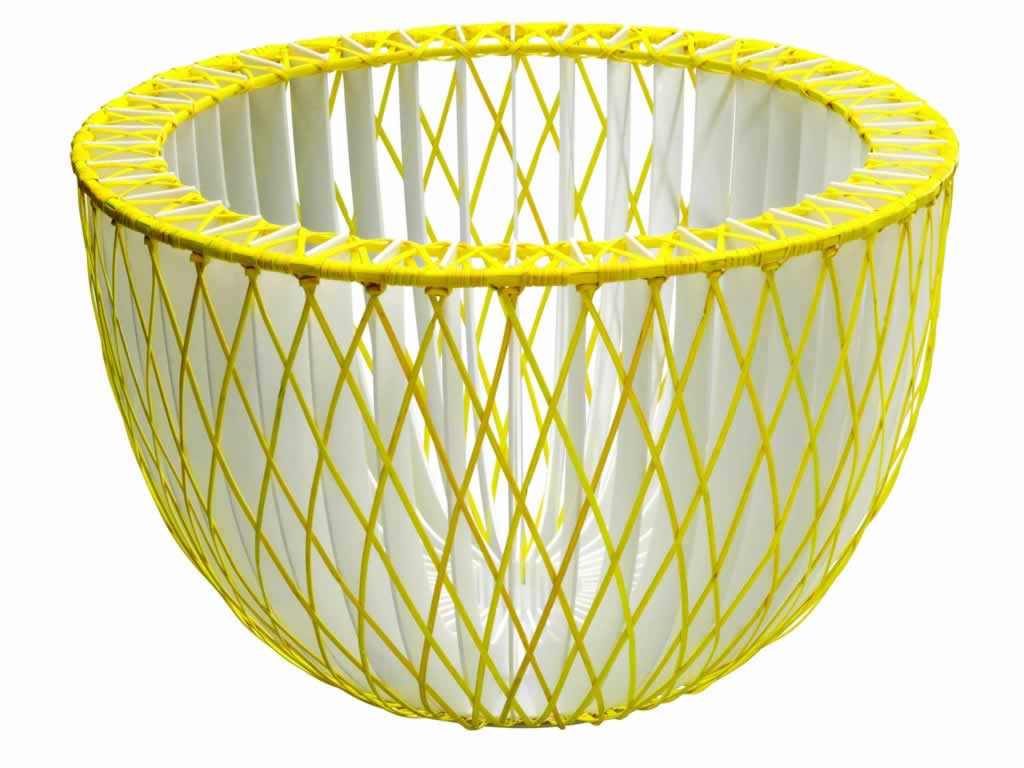
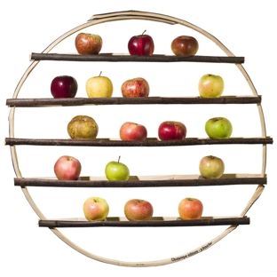
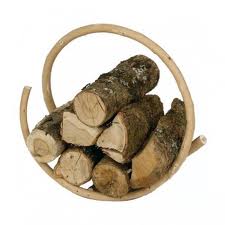
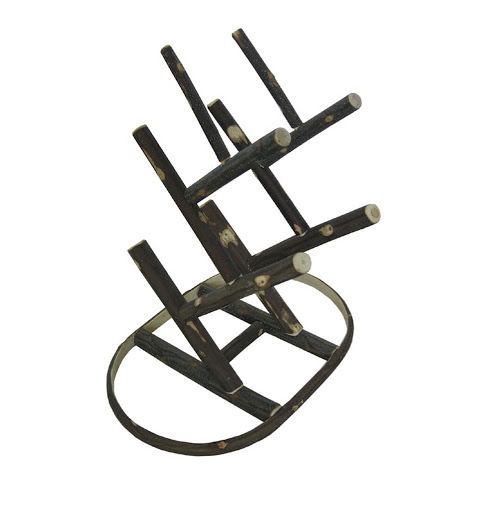
At the beginning Cyril Delega did not produce, he only drew, but later he learned the woodworking, discovering some techniques on a whim and others for passion and curiosity. His collaboration with the landscape architect Gilles Clément during an exhibition at the gardens of La Villette in Paris in 1999, gave him the impetus he lacked: the road was the right one. The next one with the designer Godefroy de Virieu, instead, passing through Nontron, in the Dordogne, right in the country of the leafy trees, in 2004, generated some poetic pieces of great beauty such as the slender chair with a high back or the famous “Arbre d ‘hiver “, a round structure for storing fruit, to be hung on the wall or suspended with a cable, or even the” la Brassée “wood holder, a single curved chestnut branch, simple and refined. His work continues constant and passionate, always guided by nature.

Website

Tsé & Tsé associées

Tsé & Tsé associées

Tsé & Tsé associées is a French design company, one of the rare still independent from its creation in 1991, founded by two Parisian designers, Sigolène Prébois and Catherine Lévy. The company has now achieved worldwide fame and the Tsé & Tsé team, composed of less than ten people, masters the design of the objects from their conception to their production and distribution.
Prototypes of Tsé & Tsé associées are created in the charming laboratory in the Bastille area in Paris, an old carpentry shop, where some items can be adapted to the specific needs of customers. Each object requires special research to find the best quality manufacturers and ensure the use of noble materials, according to traditional know-how, which favors the quality and durability of the objects. For this reason, lamps, dishes and furniture are made in small series, sometimes individually and rarely more than 1000 items per year. Each item is unique, never the same and these differences are the inimitable signature of Tsé & Tsé.
The two designers began to create objects for themselves, in order to savor and cheer up every moment of daily life: the sense of wonder with which they imagine everyday objects shines through in all their creations. A few years later, most of their objects became bestsellers and museum pieces, while remaining fresh and delicious as always; their latest creations adapt perfectly to the others to form an expanding and very original universe, always full of a joyful ironic streak.
Their most iconic object is undoubtedly the “Vase of Avril”, now a classic of French design: inspired by Japanese Ikebana, this vase glorifies the beauty of flowers by isolating them in a tube; articulated with metal rings, the vase adapts its shape to the flowers, giving each person the pleasure of composing a splendid floral composition. Another project of great beauty is the “Vase Parasseux”, suspended in the air by a steel cable, swinging back and forth in a carefree way. Looking at this object, it seems to admire a waving acrobat in the circus; the vase can hang close to kitchen tables and counters, loving all flowers, especially the branches and ivy with asymmetrical arrangements.
Finally, among the many works, to remember the project of the two artists for the table, with the poetic dishes made in porcelain, which combine solidity and finesse; the dishes and dishes are made in France according to a traditional method between two plaster molds. Their “imperfections” are the sign of their originality and completely manual realization.

Website

Eugenio Vazzano

Eugenio Vazzano likes to summarize his work in these three maxims: “hands instead of the machine, the shop instead of the factory, the passion that becomes work”. This is his conception of craftsman; an “artistic craftsman”, as they often call him, who does not rely on digital technology, but remains tied to manual skills and high-level professional processing techniques. Techniques that are daughters of the ancient traditions of which Italy and in his case Sicily in particular are the cradle.
Last of seven children, born and raised in Melilli, who moved to the United States at the age of fourteen to study art and chase his dream, he returned to Italy and chose Florence to study at the American Academy of Art, working simultaneously in a the city’s prestigious fashion boutique. The desire to return to Sicily in his Melilli quickly comes forward and arises from the certainty of the roots and from the familiarity with the patrimony of experiences: a genetic patrimony that receives references, suggestions, motifs of inspiration in a continuous reference to art, culture and the costume of Sicily.
The global curiosity of the long American youth experience remains, which allows to naturally combine the Baroque splendor to poor art, and above all the courage that gives birth to the “Melilli factory”, the manufacture, housed in an old caponata factory, in to which blankets, throws, towels are born … but also tapestries and refined “rags” for the home, as he likes to define them himself.
The laboratory-atelier now includes more than ten collaborators, who work with the same philosophy, inspired by the recovery of a still alive past and creative recycling: each piece of advanced fabric is the beginning of a new story, the essential first piece of a new work of art. The fabrics used are many, from the most traditional such as fine silks, refined cottons, linens and velvets, cashmere, brocade and jacquard, but also unusual fibers such as raw jute, oriental wool and jeans, which are then dyed, creased, decorated.
The American years were very important to refine some techniques and knowledge: in Miami, in fact, in the nineties, the desire to know led the artist to frequent the warehouses where used clothes for the homeless were kept: from those ready-made clothes with fabrics from the thirties, forties and fifties, the first patchworks were born, then they became the most recognizable brand of all of Vazzano’s own work.

Website

Buro Belèn - Ferrero1947

Buro Belèn

Buro Belèn is founded by Brecht Duijf and Lenneke Langenhuijsen, who met at the Design Academy in Eindhoven, the Netherlands.
After graduating with honors from the Eindhoven Design Academy, Brecht started working as a part-time designer for Forbo Flooring and then for a few years as a freelance designer and then decided to found his own clothing label “18-11-81 “in 2014. In 2010 he won a Classi Calvijn award, in 2012 his activity was funded by BKVB.
Lenneke graduated with honors from the Eindhoven Design Academy with her Wooden Textiles project and was among the finalists of the Doen Material Prize in 2011, the Green Design Competition in 2012 and won Open Design Italia in 2013.
Together, Brecht and Lenneke founded their studio ” Buro Belèn ” in Amsterdam and initially received a grant from the DOEN Foundation for “sustainable creative entrepreneurs”; currently they teach at the Design Academy of Eindhoven and the Artemis Akademie Amsterdam, alternating teaching design projects.
The “Another Plaid” project has obtained great visibility for the original and highly ecological process through which it is carried out: it is a question of not completely completing the coloring and dyeing process in a machine that has not been rinsed, thus saving both dyeing water.
A single reel of wool will be transformed into a single plaid with its unique color pattern; the merino wool plaid shows a great contrast of color and clear signs, incorporating a range of colors. Therefore, by abstractly modifying the first phase of the industrial process which normally sees an equally colored reel, each plaid varies in design and color; the outside of the coil absorbs more color than the inside, especially when it is intertwined with a different texture. The result is poetic and very graphic at the same time.
Buro Belèn then design with materials, expanding and expanding the material qualities of spaces, objects and products and creating a tangible design for the future. At the heart of their approach are the intuitive, emotional and physical aspects of design, which translate into products and visions that show unexpected applications of material and colors, as well as revaluations of conventional techniques.
One of their best known projects is “Cambials”: a label that produces natural wood interior fabrics. Among the works also the stole commissioned by the Dutch manufacture CHP, in silk with a very high definition photographic reproduction of naked bodies of friends and collaborators: a technological and romantic garment, not without a subtle vein of irony.

Website

Jupe by Jackie

Jupe by Jackie

Based in the Netherlands and India in Uttar Pradesh, Jupe by Jackie is an internationally renowned fashion brand born from the desire to shed light on the art of hand embroidery in a completely new way, revitalizing a dying craft in industry of today’s fast-paced fashion.
Jupe continues to make his mark as a leading embroidery company in an attempt to let Indian craftsmanship not only live, but thrive.
From 2013 to 2017 the brand collaborated intensely with the famous Japanese avant-garde fashion label Comme des Garçons, to then favor an independent road and its own collection.
Designer Jackie Villevoye founded Jupe in 2010 at the age of 54, after raising her five children; when they left home, Jackie’s permanent enthusiasm for design became even more determined: after studying in depth the art of Indian hand embroidery, Jackie embarked on a journey that led her to organize a team of talented craftsmen of embroidery. A passionate, refined and unique collaboration was born.
Jackie’s Jupe developed in 2019 a new collection of hand-embroidered mohairs and designed a series of 10 splendid plaids and exclusive blankets for the world of home and interior design.
In 2017, Jackie’s Jupe had already taken an exciting first step into the world of design, launching his first interior design collection, labeled Jupe by Jackie Home. With the limited edition 2019 collection, however, the designer takes a further step and definitively enters the Olympus of author and collectible design.
As a counterweight to the mass-produced and printed fabrics, Jackie’s Jupe aims to revive the ancient art of hand embroidery that seemed to have left the interior world. With a modern and subtle embroidery, free of mechanical repetitions, the fabrics become a rare art, allowing interior fabrics to become architectural or poetic objects. Their strong color combinations and balanced proportions add to a room not only functionality, but also an artistic atmosphere, balancing nature and culture and emphasizing the beauty of both worlds.

Website

Alegria van der zande - Ferrero1947

Alegría van der Zande

Alegría van der Zande was born in Breda in 1988 and graduated in 2015 from the Utrecht School of the Arts as a product designer, after finishing her previous studies in advertising and communication in Nimeto in Utrecht. His interest and love for nature are manifested from the earliest works and remain the guiding thread of all his projects. His laboratory is based in Breda.
With his “Fossils” project Alegria van der Zande embarks on a journey in search of the small wonders of nature: wild flowers and plants from our daily environment, but very special in structure and color. Showing the value of seeing the finest and most delicate beauty of nature, the designer presses flowers and plants on the skin, two natural products combined with a new element, a technique he designed during his graduation process at the Utrecht School of the Arts.
What leaves the print is a combination of raw leather and aesthetic lines and soft colors of the flowers and plants collected from nature.
Each Alegria van der Zande’s work is unique and finds its extreme refinement and beauty even in imperfections, since the skin is a natural product, with a beautiful contrast between the hard skin and the graceful details of the plant; also the natural color of the skin acts as a background in contrast to the soft and delicate colors of the selected flowers and plants, with careful botanical research around Dutch meadows, fields and woods.
“Fossils” therefore shows us the value of seeing the most beautiful and delicate beauty of nature that surrounds us every day, but which we do not always observe with the right attention; the uniqueness of this project changes with the passing of the season, following the rhythm of nature.

Facebook

Studio Wieki Somers

Studio Wieki Somers

Wieki Somers and Dylan van den Berg studied at the Eindhoven Design Academy in the late 1990s and in 2003 they founded the Wieki Somers Studio, which is focused on reading the environment in which we live every day. The work of the studio is distinguished by a great attention to materials, technological research, and imagination.

The designers work for a wide variety of international manufacturers, museums and galleries, and have established an intense relationship with some private collectors. They have received numerous awards and their works are part of important collections, including the Museum of Modern Art in New York, the Center Pompidou in Paris, the Boijmans Van Beuningen Museum in Rotterdam and the Victoria and Albert Museum in London. Ferrero 1947 is proud to present their limited edition collections of 99 specimens of vases, which link their shape to some reflections on the water. The result is a very poetic collection, of great craftsmanship and preciousness.

In this collection the most complex project from an artisanal point of view and the most intense from an aesthetic point of view is “Ice Flowers”: an ice-like cube that refers to Global Seed Vault on Spitsbergen. A set of glass sheets layered with petals in the middle that create a depth and a new scene with the real living flower. Another example of great charm is “Narcissus”, inspired by the painting “Narciso” by Caravaggio; a metaphor for the destructive relationship between man and nature. The vase shows a isolated flower in a puddle of oil. “Water Levers” is inspired by the current theme of continuously measuring our water levels due to climate change; the composition with flowers, volumes within volumes, use of different levels of water and a mirror base, together create an unexpected stratification. “Deepwater” the design of the deep waters refers to the oil that originates on the bottom of our oceans, whose natural balance with water it is interrupted by human actions; these actions can cause eco catastrophes such as “Deepwater Horizon”. Finally the “Erosion” model is inspired by the book “La lecture des Pierres” by Roger Caillois; erosion on earth is caused by natural elements such as wind, water and glacial ice. It is the process by which the surface of the Earth wears out.

Website

Studio Kolk & Kusters

Studio Kolk & Kusters

Maarten Kolk (1980) and Guus Kusters (1979) have been working together since 2009, the year of opening of Studio Kolk & Kusters. Both graduated with honors from the Eindhoven Design Academy, they develop independent projects and commissioned works as set-ups and curators of exhibitions and shows.
According to their philosophy poetry is found in nature and elements such as history, color and landscape are the foundation of their work, trying to translate this into objects, applications of materials, exhibitions and innovative production methods.
The Firm received the Sanoma Jong The Talent and Doen | Materiaalprijs’11 and in 2009 their work “Veldwerk” was nominated for the design prijs in Rotterdam. Since 2013 Maarten Kolk has been a member of the consultative committee for the design of creative industries “Fondo NL” and Guus Kusters is tutor at the Design Academy in Eindhoven.
Their first works of great success, still in great demand today, are herbals of great poetry, which reflect the custom of many aristocratic and wealthy families in many Nordic countries, but also in France, Great Britain and Italy to create decorative panels composed of plants and flowers from their gardens;
in this case the artists use tradition, according to their style and way of working, updating it through contemporary techniques. The selected flowers and plants are in fact laid on different layers of fabric with a soft, poetic and romantic effect of strong impact.
Another very interesting work of theirs concerns a collection of dishes called “Crockery to wither”. This hand-painted eight-piece floral dining set is produced by the famous Royal Tichelaar Makkum, a Dutch manufacturing company founded in 1572 and specialized in designer ceramics and porcelain, also a supplier of the Real Casa. Traditionally, the paints on fine porcelain are applied by hand, making the job high intensity and therefore expensive. In this project Maarten Kolk & Guus Kusters have developed glazing techniques that do not require artisans to paint the dishes directly, but rather to insert this process during the mold before the product is melted, making it possible to make several copies of a painting. After each launch the glaze is washed further and crumbles, drawing a clear parallel with flowers withered in nature; the image of the flower is clear and sharp after the first launch, wilting and fading after multiple reproductions.
With this collection the Studio Maarten Kolk & Guus Kusters balances nature and productive culture, emphasizing the beauty of both worlds. The service consists of two plates of different sizes, bowls, a cup, a carafe, a large plate to be used as a plate or tray and a vase in 6 or 9 different decorations.

More info

Studio Job

Studio Job

The twin souls Job Smeets and Nynke Tynagel founded Studio Job in 2000, after studying at the Design Academy in Eindhoven and in a few years they became contemporary cultural pioneers, slowly revolutionizing common preconceptions about the distinct realms of art and design. Striving towards the creation of Gesamtkunstwerk, which sometimes translates poorly into “aesthetics”, but more precisely means a ‘synsthesis of the arts “or” universal works of art “, the Studio Job often refers to the aesthetic ideals of the composer Richard Wagner in their practice that tries to move towards the clearest and deepest expression of stories and mythologies.

Studio Job’s work is in the true spirit of the Renaissance in which techniques are exchanged and disciplines are ignored towards the creation of the new, where ideas and images are easily profused regardless of geographical or conceptual boundaries and are reproduced in something new, in which culture, spirituality and aesthetics converge in a single space, and where production and craftsmanship become a bridge between art and design, occupying and redefining the gray area in the middle.

Studio Job creates a type of work that addresses classic, popular and contemporary design and visual art. The symbolism and iconography that Studio Job creates is heraldic and regal even in its imaginary pop cartoon; an elegant but also instinctive and almost primordial work.

Job Smeets loves to call their style ‘New Gothic’ as evidenced by the perfectionism and uniqueness that have become one of the characteristics that define the studio itself, while Nynke Tynagel often talks about the work referring to a symphony orchestra, aligning their process of creation with the way that a cohesive musical piece was created by a great variety of different sounds, also remembering that each of the parts is of equal importance as it lends itself to the realization of the whole or of the universal graphics.

The studio includes traditional and contemporary artisans, professionals, industrialists from the production of furniture, sculptors and painters, specialists in cast bronze, colored glass, laser cutting and 3D printing, all in their different specializations, just like the aforementioned orchestra. Unique in its approach and extravagant in detail, Studio Job announces a new moment in the current conversation about the definition or lack thereof between the disciplines. Contrary to the contemporary ambivalence towards the decorative arts, Studio Job is revolutionizing the perception of gender, generating opulence, ornaments, complexity, maximalism, while at the same time it remains committed to a high level of craftsmanship.

Their production oscillates between limited editions and unique pieces for the most famous design galleries and museums in the world, the collaboration with famous design companies such as Moooi, Seletti, Lensvelt and Makkum and special projects such as the scenography for the concerts of the pop star Mika .

Website

Sholten & Baijing

Scholten & Baijing

Scholten & Baijing have been working together since 2000, with the creation of their studio; Stefan Scholten studied at the Eindhoven Design Academy, while Carole Baijings is self-taught. After the realization of several projects in which the boundaries between autonomous and applied work are perceived, in their subsequent works there is more interest in interior design up to be considered as one of the most interesting, innovative and dynamic duo in the field of world level.

Famous for their sensitive and discreet but functional products, their extraordinary and often unexpected use of color, their exquisitely made objects, they have applied their unique style in the most diverse sectors, from ceramics and silverware to fabrics and even to a concept car.

Scholten & Baijings have received numerous prestigious awards such as the Elle Decoration International Design Award (EDIDA) for Young Designer Talent 2011, the nomination for the Designer of the Year at the Wallpaper * Design Awards 2015 and the Oeuvre Sanoma Woon Awards 2014.

Their products and limited editions are exhibited in museums and galleries such as the Cooper-Hewitt National Design Museum in New York, the Art Institute of Chicago, the Victoria & Albert Museum in London and the Boijmans van Beuningen Museum in Rotterdam. Their clients include many contemporary and experimental companies such as Maharam, Hay, Ikea, Karimoku New Standard, Georg Jensen, 1616 / Arita Japan, Moooi …

Based on extensive research on Arita ceramics and the analysis of local historical masterpieces, for example, Scholten & Baijings have created a series called colored porcelain. Typical Japanese colors, such as, for example, light green aquarelle-blue, red-orange and ocher, are recontextualized and applied in new combinations in a set of functional contemporary tableware that overall still reflect the typical Arita color spectrum, in a new and unedited refined and very contemporary image. The layered color compositions are carried out in various enamel textures and shades and are combined with the natural white of the porcelain itself. Made with a delicate sense of local craftsmanship, the color of the porcelain shows an original European perspective on the Japanese tradition.

This same approach has been used for many other materials such as wool, wood, glass, always looking for unusual combinations of colors, the result of stratifications and reflections and with an eye always turned to the Dutch tradition. From 2019 the two designers have decided to continue the work independently.

Website

1 2 3